
Indian Overseas Bank –
Retail & Corporate Banking

IOB - Net Banking Experience Revamping
CONTEXT
Project Context
The internet banking platform supports daily retail transactions and complex corporate banking activities.
Over time, increasing feature depth and role-based requirements made core tasks harder to discover, navigate, and complete—impacting efficiency and user confidence.
Company Context
-
Indian Overseas Bank is a large public-sector bank serving 29M+ customers across a highly regulated environment.
-
The bank’s ongoing digital modernization requires redesigning legacy systems while maintaining security, accessibility, and governance at scale.
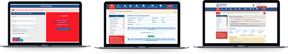
Old IOB design
MY ROLE
-
Discovery, gathering design requirements, project scoping and understanding of
on-ground banking workflows.
-
User flows & design explorations
-
Designed end-to-end workflows for all categories of banking apps
-
Collaborated with engineering and stakeholders to align feasibility and scale
TIMELINE
9 months (Research, concept to handoff)
THE TEAM
2 UX Designer
1 UI Designer
1 Lead Designer
Team of Engg
PROBLEM STATEMENT
How might we simplify Indian Overseas Bank’s internet banking platform so retail and corporate users can complete high-frequency and high-value transactions efficiently, with clear navigation, role-based access, and consistent experiences?
GOALs
-
Simplify complex banking workflows
-
Improve clarity between retail and corporate journeys
-
Reduce cognitive load for frequent and critical tasks
-
Align the experience with modern banking expectations while meeting regulatory constraints
UNDERSTANDING USERS
People who use banks for personal financial transactions and services, such as savings accounts, checking accounts, loans, mortgages, credit cards, and investment services. The customer demographics of individuals who use IOB platform can vary depending on factors such as age, gender, income, education, and geographic location.

User Segments
Retail Users:
Everyday banking, bill payments, transfers
Corporate Users:
Change the text and make it your own. Click here to begin editing.
Bank Admins:
Monitoring, support, and operational oversight
KEY PROBLEMS IDENTIFIED
Dashboard - Experience challenges
-
High cognitive load
Retail banking dashboards aggregated multiple data sets, charts, and actions in a single view, making it difficult for users to quickly identify what mattered most.
-
Weak information hierarchy
Critical actions and insights were not visually or structurally prioritised, forcing users to scan extensively to complete routine tasks.
-
Limited role adaptability
The dashboard did not sufficiently adapt to different user needs or banking contexts, reducing its effectiveness for both frequent and infrequent users.
-
Inconsistent navigation patterns
Navigation and interaction behaviours varied across sections, increasing learning effort and leading to user errors.
-
Unclear language and system terminology
Labels and terminology reflected internal banking constructs rather than user mental models, creating friction in understanding and decision-making.
-
Ineffective visual communication
Data visualisations lacked consistency and clarity, limiting users’ ability to interpret information quickly and confidently.
Key Problems Identified
-
Overloaded dashboards with poor information hierarchy
-
Similar tasks are presented differently across retail and corporate flows
-
Critical actions are buried under multiple steps
-
Lack of contextual guidance for first-time and infrequent users


INFORMATION CATEGORIES
Retail Dashboard
-
Information that requires the user’s attention
- Important Notice-
- Attention Required - To Do’s/Bills Due
-
Information that requires the user’s attention
- Financial overview
- Account summary
- Quick payments
- Recent actions
- Recent transactions
-
Information that shall support the usage
- Offers
- Pre-approved Loans
- Rate us
- Investment schemes
- Customer support
DASHBOARD LAYOUT DESIGN
Built a role-based, modular dashboard that surfaces critical banking information and actions at a glance, reducing navigation and improving task efficiency.

OUTCOME
-
Simplified the retail and corporate dashboards by introducing clear information hierarchy and role-aware views
-
Reduced cognitive load by prioritising high-frequency tasks and surfacing relevant information upfront
-
Improved usability through consistent navigation patterns and clearer terminology
-
Created a scalable dashboard foundation aligned with security, accessibility, and governance constraints
🔐 Protected Case Study
This project is confidential.
Please get in touch with yashvimodh27@gmail.com for access.
More Projects


Enhancing the escalation experience for multiple user roles of the company.